Legislation tracking dashboard redesign

Platform
Desktop
Duration
2 months (2025)
Project
Quickdata Studio
My role
UX/UI designer
Problem statement
This digital product is a legislation assistant that allows users to keep track of the law processes and status. Due to the complex structures it keeps track of, it ended up having an overwhelmingly crowded dashboard with bigger than screen tables and non intuitive structure.
Challenge
  • Full UI redesign of the product features with minimal structural changes;
  • Understand and prioritise the information with minimal research;
  • Identify the UX  flaws and solve them;
Process
I redesigned 10+ features, based on expertise and client input.

I developed a Design System for growth and usability, grounded in their existing graphic style + MUI components.

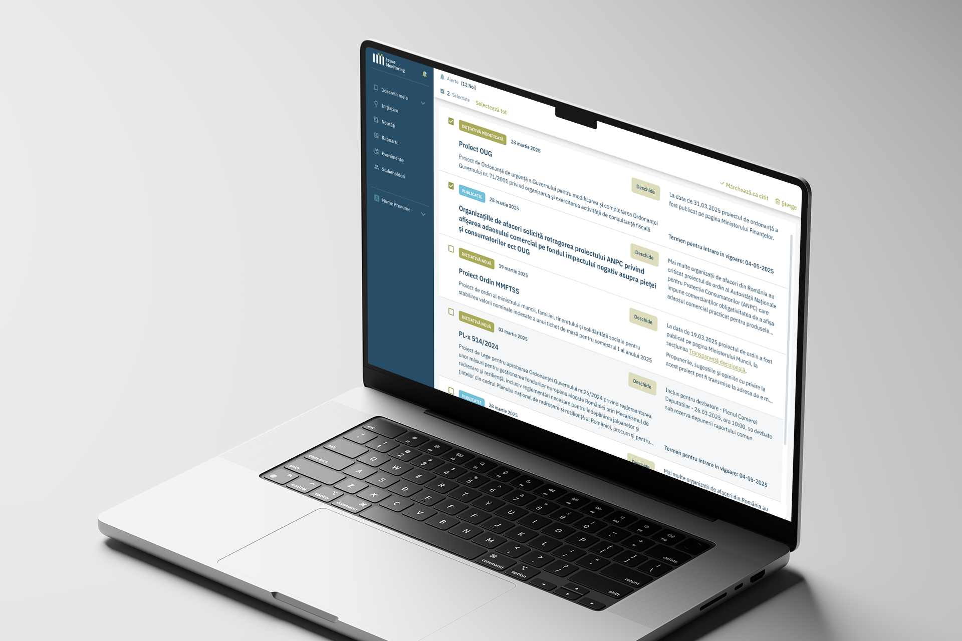
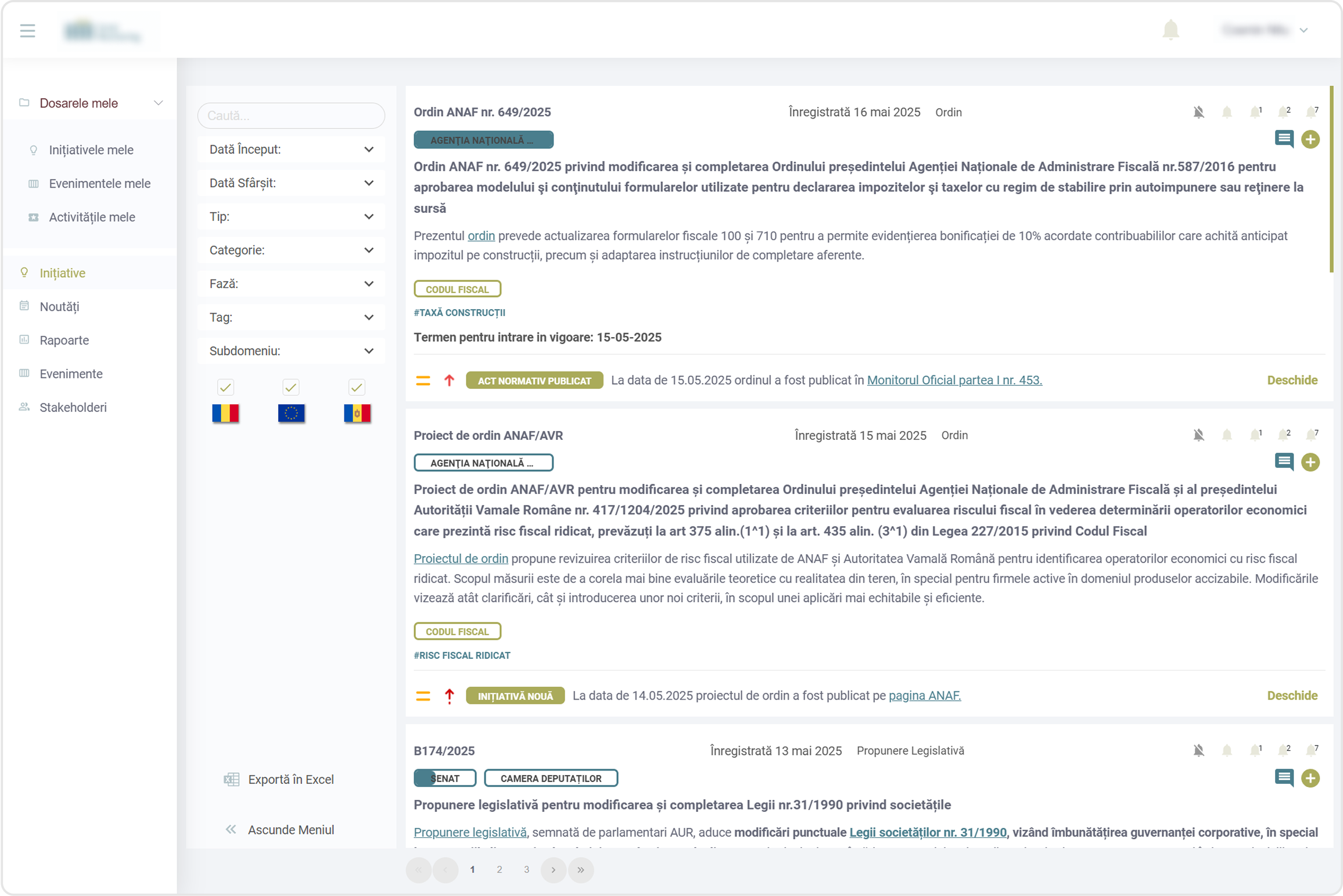
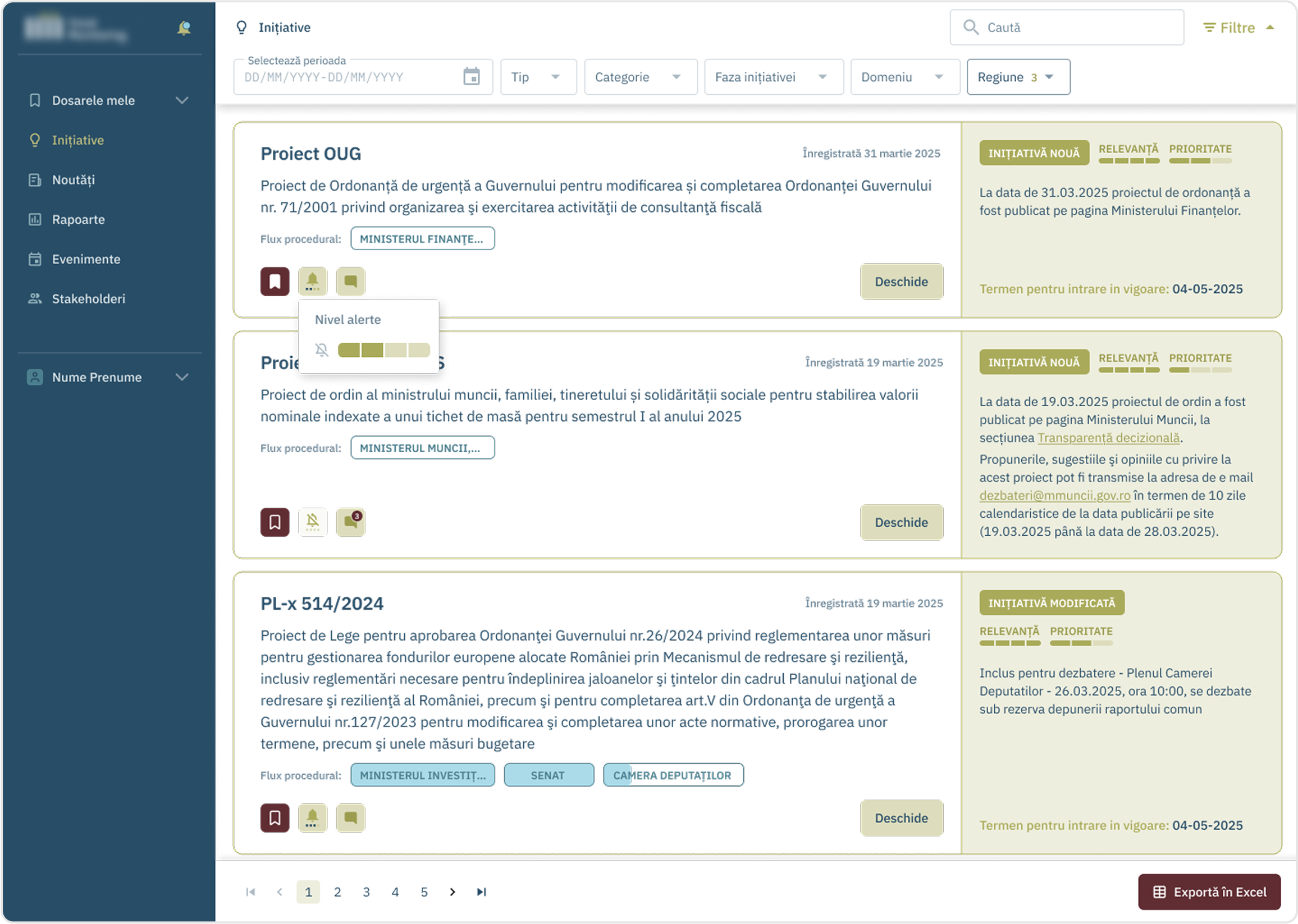
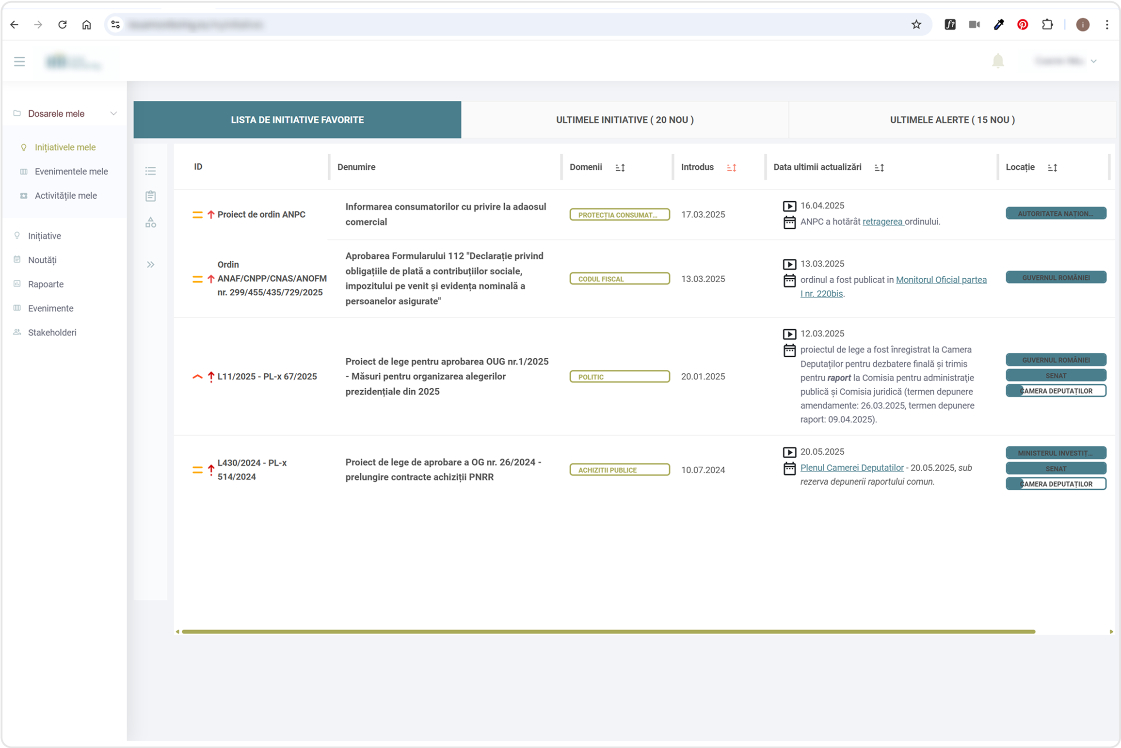
Here are some of the solutions I adopted, in a before and after display:

Navigation and filters

Issues
The lack of horizontal space when having the menu and filters expanded made it hard to follow the content in the table;

Some features were hidden in tabs with no relevance to the context;
Solution
I structured all the navigation in the left bar;

Added some features that were hidden in tabs;

Moved the profile and the notifications;

Moved the filters to the top of the screen;

Legislative motions feed page

Issues
Hard to read: The text lines were too long because of the horizontal layout of the cards;

Lack of visual hierarchy: ex. the colored tabs were more evident than the buttons;

Lack of structure: information spreaded anywhere it fit;

Lack of identifiers: icons that lack recognition
Solution
I structured the cards into two columns: about & progress;

Icons that are more intuitive and with status feedback;

Secondary text on mouse hover to make the cards less crowded;

More structure given by using: typographic hierarchy, color, proximity;

Saved motions page

Issues
Hard to read: Table too long even for a big screen, let alone a standard laptop one;

Lack of identifiers: icons that have no conventional meaning;

Actions hidden in the far right of the table, not shown on the screen right away;

Table content that is not relevant;
Solution
All actions on the left side, always visible;

Merged some information (eg. status tab);

Icons replaced with track bar + text